Mobile First: How Customers Read Catalogs on Smartphones
Over 60% of B2B research now happens on mobile devices. Yet most traditional PDF-based catalogs are a disaster on smartphones — tiny text, awkward zooming, horizontal scrolling. flipaio was built with a mobile-first architecture that ensures your catalog looks and works perfectly on every device.
Responsive Design Is Not Enough
Simply making a webpage “responsive” is not sufficient for a product catalog with hundreds of pages and complex layouts. flipaio uses an intelligent rendering engine that dynamically adapts each catalog page to the screen dimensions, orientation, and resolution of the viewing device — without distorting your original design.
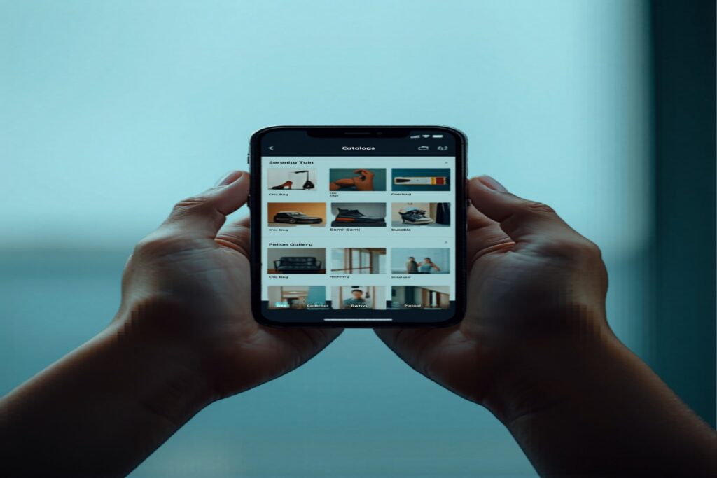
Touch-Optimized Navigation
Smartphone users navigate differently than desktop users. flipaio’s mobile interface is built for touch: swipe to turn pages, pinch to zoom into product details, tap to open videos or webshop links. The entire interaction model is designed for thumbs, not mouse pointers.
Offline Access for Field Sales Teams
What happens when your sales representative is in a basement showroom with no WiFi? flipaio’s Progressive Web App (PWA) capability allows catalogs to be cached locally on the device. Your team can present products confidently even without an internet connection — a critical advantage in field sales situations.
Speed Is a Dealbreaker on Mobile
Mobile users are impatient. A catalog that takes more than 3 seconds to load on a smartphone will be abandoned. flipaio’s CDN-powered delivery and intelligent lazy loading ensure your catalog loads instantly on mobile networks — even on 4G connections in rural areas.